- Email yeldocollegesmd@gmail.com
- CALL +91 98461 10506 +91 98468 77776
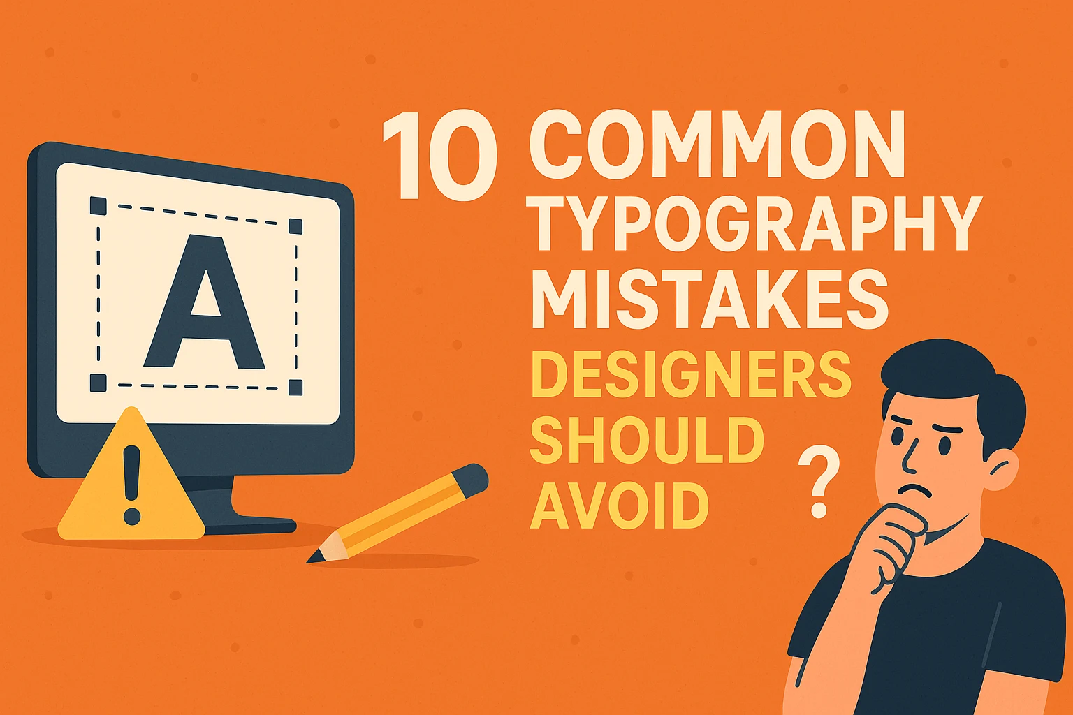
Good typography plays an important role in making your brand more effective. When executed well, typography guides the reader's eye seamlessly through the content, allowing them to absorb information without distraction. Conversely, if you avoid typography mistakes, your designs will be well received by people, as errors tend to stand out more than good choices.
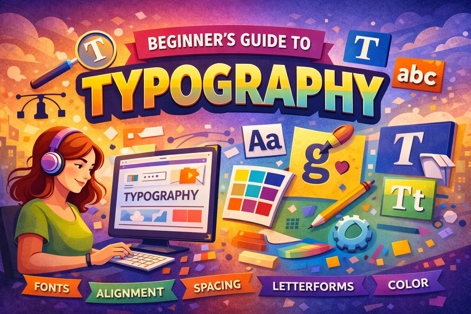
Typography is the art and technique of designing, setting, and arranging type. It involves selecting fonts, sizes, spacing, and layout to enhance communication and convey a specific message through the written word. Since typography is an inevitable and basic part of creating designs, mastering its simple concepts and rules is crucial for turning a good graphic design into a great one.
Here are 10 common typography mistakes designers should avoid to ensure their work is clear, professional, and visually appealing.
--------------------------------------------------------------------------------
Poor adjustments to the space between characters and lines are major pitfalls that compromise legibility.
Leading refers to the space between two lines of text. Congested lines can affect legibility and make the copy difficult to read because it is too bunched up. Conversely, too much line spacing can ruin the connection between the lines of type.
• How to fix it: While there is no fixed rule for leading, logical legibility should guide your aesthetic decisions. Making your leading generous helps type to breathe and immediately makes paragraphs look more elegant.
Designers spend a lot of time deciding on tracking and kerning. Tracking (or letter-spacing) refers to the amount of space between a group of letters or an entire word or phrase. Kerning is the process of adjusting the spacing specifically between two characters in a proportional font. Even small inconsistencies in spacing can throw off the balance of a logo or text block.
• How to fix it: Too much tracking can harm legibility. A rule of thumb can be to leave tracking at its default value for a perfect look, though you might lower it for a headline to make it appear heavier. For kerning, pay attention to specific letter pairs (like W and A). A great tip for improving kerning is to flip the type upside-down to focus solely on the visual symmetry of the letters, without being distracted by the content.
Stretching or condensing words terribly to size them into a particular space is a disastrous mistake. This blunder ruins the letters, giving them a shape far from their original form.
• How to fix it: When scaling a textbox, always keep the proportion in mind. In programs like Photoshop and Illustrator, you must hold the Shift key while dragging the corner of the text box. Additionally, avoiding linear scaling is recommended for UI purposes, as it can lead to massive type sizes that don't fit well in web or mobile apps; instead, opt for a contextual or responsive scaling system.
--------------------------------------------------------------------------------
These mistakes directly hinder the reader's ability to navigate and process the text effectively.
Readability is essential if you want your design to be a hit. Sometimes designers make incompatible choices, such as fine, white text on a black background, which might look classic but is difficult to read. This is often due to inadequate contrast with the background. Legibility hurdles include font being too small, font and background colors not working well together, or transparency effects harming visibility.
• How to fix it: For long passages, ensure the text is clear and simple to read, working on aspects like tracking, leading, and font size. When fixing contrast, stress your eyes and ensure you can easily read the characters, perhaps by reducing color effects or ensuring sufficient contrast between shades.
Hierarchy distinguishes between various textual elements to highlight their order and importance. When you ignore hierarchy, you create chaos for viewers who don’t know where to focus first.
• How to fix it: Implement an ABC effect: A is the largest, most prominent heading; B is a slightly smaller sub-heading (perhaps in semibold or italic); and C is the smallest-scale body text (but still legible). This organization gives structure and instantly helps guide the eye.
These are typographical terms for lines or short words that break the visual flow.
• Orphans are the first line of a paragraph that appears alone at the bottom of a column or page.
• Widows are single words or very short lines, typically the last line of a paragraph, appearing by itself at the top of a new column or page. Widows leave ample white space on the preceding page and disrupt the visual rhythm.
• Runts are the last word of a paragraph left stranded on a line by itself, creating an awkward, unbalanced look.
• How to fix it: These issues must be tackled to avoid white space interrupting the flow of text. Solutions include manually changing lines at breakpoints, adjusting tracking/kerning of the affected paragraph, changing line length, or, for runts, using a nonbreaking space to tie the last word to the one before it.
Rivers (or rivers of white) are visually distracting gaps of white space that appear to run through a justified paragraph, caused by the coincidental alignment of word spaces. Ragged edges (or rags) refer to the uneven vertical margin of a text block. Bad rags, characterized by dramatic line endings, draw the reader’s attention away from the content.
• How to fix it: To fix rivers, you can adjust tracking/kerning, improve hyphenation, or change from justified text to ragged right alignment. To fix bad rags, manually adjust line breaks using a soft return, or tweak hyphenation and justification settings.
--------------------------------------------------------------------------------
Poor choices in font selection and styling can signal amateurism and confuse the audience.
New designers often use too many fonts and weights in a single design. Adding too many typefaces can irritate the reader and make the design appear disintegrated. Inconsistency with spacing, sizes, typeface usage, and font usage is a massive sign of amateurism.
• How to fix it: It is advisable to limit a particular design to a maximum of three different fonts. You should only introduce and define a new style if there is a specific need and use case for it. Using the same font with different sizes and density is less problematic than adding too many typefaces.
Using a font style that clashes with the content or brand purpose can disjoint and confuse viewers. For example, using a fun, cheerful font for a business report would be poor design. Furthermore, using cheesy typefaces—those that are overly designed, decorative, or trendy—is often overused by designers, especially beginners who misunderstand the power of graphic tools.
• How to fix it: Select typefaces based on their suitability. Seek attributes you want your design to communicate. A neutral typeface will beat overly designed and cheesy typefaces every single time. If you are working on a logo, avoid trendy fonts and opt for something more timeless.
Sometimes, the design requires emphasis, which can be achieved through italics, caps, boldness, underlining, or font size. However, abusing styling options by using multiple features (like italicizing, bolding, underlining, and changing color) all at once creates a mess and gives the wrong impression.
• How to fix it: Remember that less is more when it comes to styling. It should be only one out of ten times when you go for more than one feature for emphasis. Also, be mindful that writing in all caps (uppercase letters) can negatively affect readability if used for lengthy texts, as they tend to seem like they are screaming to the readers.
--------------------------------------------------------------------------------
Avoiding these common typography mistakes is crucial; it ensures your designs are not only functional but also visually appealing. Since typography is the most basic and perhaps most important tool of a graphic designer, mastering these techniques will elevate your work from good to great.
If you are ready for a creative journey and aspire to master the art of typography, Yeldo Mar Baselios College is the ideal choice. Yeldo Mar Baselios College is widely known for offering the best Typography course in Ernakulam, ensuring accessibility to quality education by blending traditional concepts of design with innovation. By providing an international standard to the Typography course in Ernakulam, Yeldo Mar Baselios College ensures students gain a comprehensive understanding of fonts, layout, and design. With experienced faculty, advanced facilities, and a commitment to nurturing creativity, Yeldo Mar Baselios College is proudly known as the best typography college in Kerala. Enrol today to cherish your artistic potential and set you up for a transformative journey into the world of typography and design.
Tags: typography mistakes
June 27, 2026
June 27, 2026

June 27, 2026

June 27, 2026
June 27, 2026
June 26, 2026
June 26, 2026

June 24, 2026

May 29, 2026

May 29, 2026

May 28, 2026
May 28, 2026

May 28, 2026
May 28, 2026
May 28, 2026

April 30, 2026

April 30, 2026

April 30, 2026
April 30, 2026
March 28, 2026

March 28, 2026
March 25, 2026

March 21, 2026
March 18, 2026

February 25, 2026
February 25, 2026
February 14, 2026
February 11, 2026

January 19, 2026

January 17, 2026