- Email yeldocollegesmd@gmail.com
- CALL +91 98461 10506 +91 98468 77776
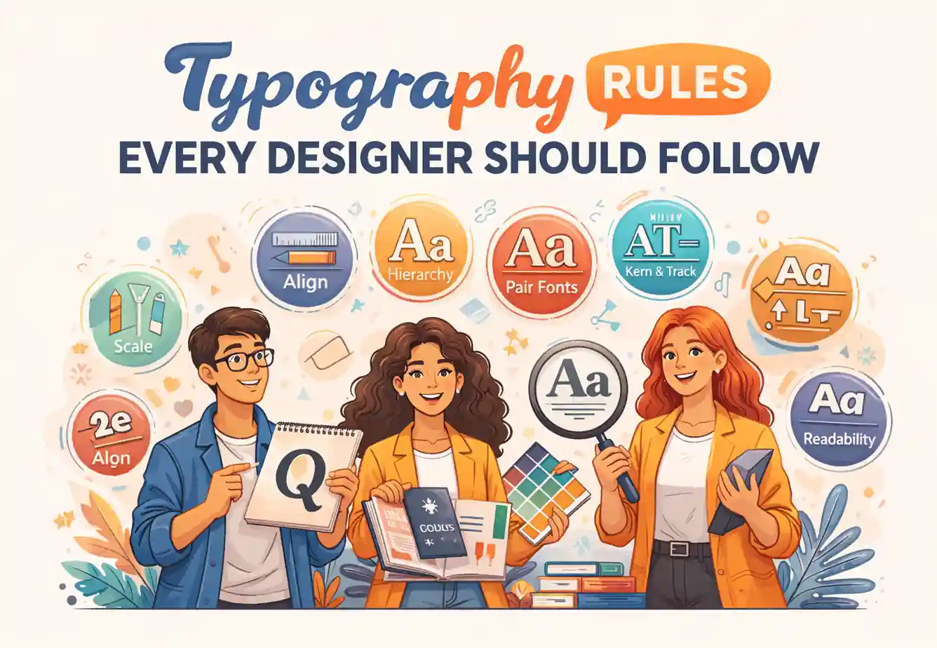
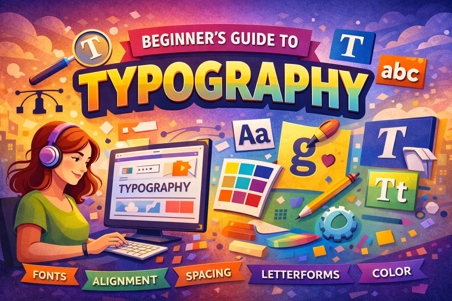
Typography influences how people read, trust, and remember content. It goes beyond just choosing fonts, it includes spacing, hierarchy, alignment, and readability. Observing typography rules every designer should follow helps designers craft clear, engaging, and professional designs that guide users effortlessly. Good typography is essential across websites, mobile apps, branding, UI/UX, and marketing creatives. Many designers sharpen these skills through a typography course in Ernakulam, learning practical techniques to balance visual appeal with usability. This blog highlights real-world typography rules that make designs readable, consistent, and user-friendly across both digital and print platforms.
Typography is the positioning of texts in such a way that written texts appear readable, understandable, and aesthetically pleasing. Typography is the choice of the type itself, the spacing of texts, the arrangement of texts, as well as the positioning of texts. Typography is not decoration for the surface. There are three objectives that typography has: the promotion of readability, understandability, and aesthetic appeal. Some websites may appear comfortable as the typographies are balanced while messy posters will not work well as they are not space well.
Basic typography concepts help designers control how text appears and feels across different layouts. Understanding font families, spacing, and alignment allows designers to maintain readability and visual balance. These fundamentals form the foundation for applying advanced typography rules effectively.
Font vs Typeface refers to the distinction between a complete font family and its individual styles. Roboto is a typeface, while Roboto Regular, Roboto Bold, and Roboto Italic are fonts within that family. A simple comparison is: typeface equals the family name, while font equals the specific style and weight.
Serif fonts include small strokes at the ends of letters and are commonly used in print, editorial layouts, and premium branding. Sans serif fonts lack these strokes and offer cleaner shapes, making them ideal for screens, interfaces, and applications. Many modern digital designs favor sans serif fonts due to their clarity at various screen sizes.
Font size defines how large text appears on a screen or page. Line height controls vertical spacing between lines, improving reading flow. Letter spacing affects overall word spacing, while kerning adjusts space between specific letter pairs. Well-managed spacing often improves readability more than changing fonts.
Good typography is essential for making text readable, engaging, and visually organized. Designers must follow certain rules for font choice, spacing, alignment, and hierarchy to ensure clarity across digital and print designs. Consistently applying these principles strengthens communication and creates professional, user-friendly layouts.
Using too many fonts creates visual noise and weakens brand identity. Most professional designs rely on one or two fonts, while three should be the maximum. Pairing a serif with a sans serif creates contrast without confusion. Consistent font usage strengthens professionalism and user trust.
Visual hierarchy helps readers navigate content through headings, subheadings, and body text. Designers use size, weight, and spacing to guide attention. Since users scan content before reading fully, clear hierarchy improves engagement and understanding.
Comfortable line length reduces eye strain and improves reading flow. Desktop layouts usually work best with 50 to 75 characters per line, while mobile screens need shorter lines. Excessively long lines reduce comprehension and often increase page abandonment, affecting user experience.
Line spacing should usually fall between 120% and 150% of the font size. Tight spacing makes text difficult to follow, while excessive spacing breaks visual rhythm. Designers adjust spacing visually to maintain balance and consistency across layouts.
Contrast plays a key role in readability. Dark text on light backgrounds remains the safest option for long-form content. Accessible contrast supports users with visual limitations and improves overall usability. Stylish color choices should never compromise clarity.
Left-aligned text creates a consistent starting point for each line, making reading smoother. Center alignment suits short headings or captions only. Justified text often produces uneven spacing on digital screens, reducing readability and visual comfort.
White space acts as a structural element rather than empty space. Proper spacing around text improves focus, comprehension speed, and visual clarity. Overcrowded designs overwhelm readers and weaken communication effectiveness.
Frequent mistakes include using all caps for long paragraphs, stretching fonts, overusing decorative styles, and ignoring spacing issues such as widows and orphans. Avoiding these errors preserves professionalism and improves reading comfort.
Typographic skills lie at the root of other design areas like graphic design, UI/UX design, branding, and digital marketing. Having good typographic skills is always a plus for designers as they play a significant role in determining the functionality and usability of the outputs. Those designers who possess knowledge about typographic principles can develop effective visual communications. There is a rising demand for designers who possess the skills to develop high-quality content for the companies. Knowledge about typographic skills will allow students to face real-life design tasks.
To be able to learn typography effectively, it is necessary to have structured education on the subject rather than just random tutorials, for this ensures that the foundational principles are learned well. Colleges teach typography as a core design subject, allowing students to learn about hierarchy, spacing, and readability of the most basic levels. By practicing, receiving constructive critiques, and devoting time specifically to studying the fundamentals, learners will be equipped with the ability to apply typography confidently in real-world design projects.
1.What are basic typography rules?
Basic typography rules include using limited fonts, proper spacing, readable contrast, and clear hierarchy.
2.Why is typography important in design?
Typography improves readability, enhances user experience, and strengthens brand perception.
3. How many fonts should a designer use?
Designers should use one or two fonts, with three as the maximum for consistency.
4.Is typography important for web design?
Yes, typography is essential for web design because it affects readability, engagement, and accessibility.
Understanding and applying essential typography rules helps designers improve clarity, readability, and overall design quality. Beginners should first master the basics before exploring creative styles. Enrolling in a typography course in Ernakulam, a typography college in Ernakulam, or a typography course in Muvattupuzha offers structured learning along with practical, hands-on experience. Institutions such as Yeldo Mar Baselios College support students in building a strong and confident foundation in desig
Contact Yeldo Mar Baselios College now to start your journey in typography and discover how precise text design can transform your creative projects.
Tags: typography rules, typography for designers, typography best practices

June 27, 2026

June 27, 2026

June 27, 2026

June 27, 2026
June 27, 2026

June 26, 2026

June 26, 2026

June 24, 2026

May 29, 2026

May 29, 2026

May 28, 2026
May 28, 2026

May 28, 2026

May 28, 2026
May 28, 2026

April 30, 2026

April 30, 2026

April 30, 2026

April 30, 2026
March 28, 2026

March 28, 2026
March 25, 2026

March 21, 2026
March 18, 2026

February 25, 2026
February 25, 2026
February 14, 2026
February 11, 2026

January 19, 2026

January 17, 2026