- Email yeldocollegesmd@gmail.com
- CALL +91 98461 10506 +91 98468 77776
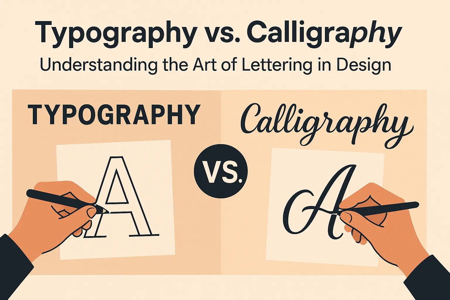
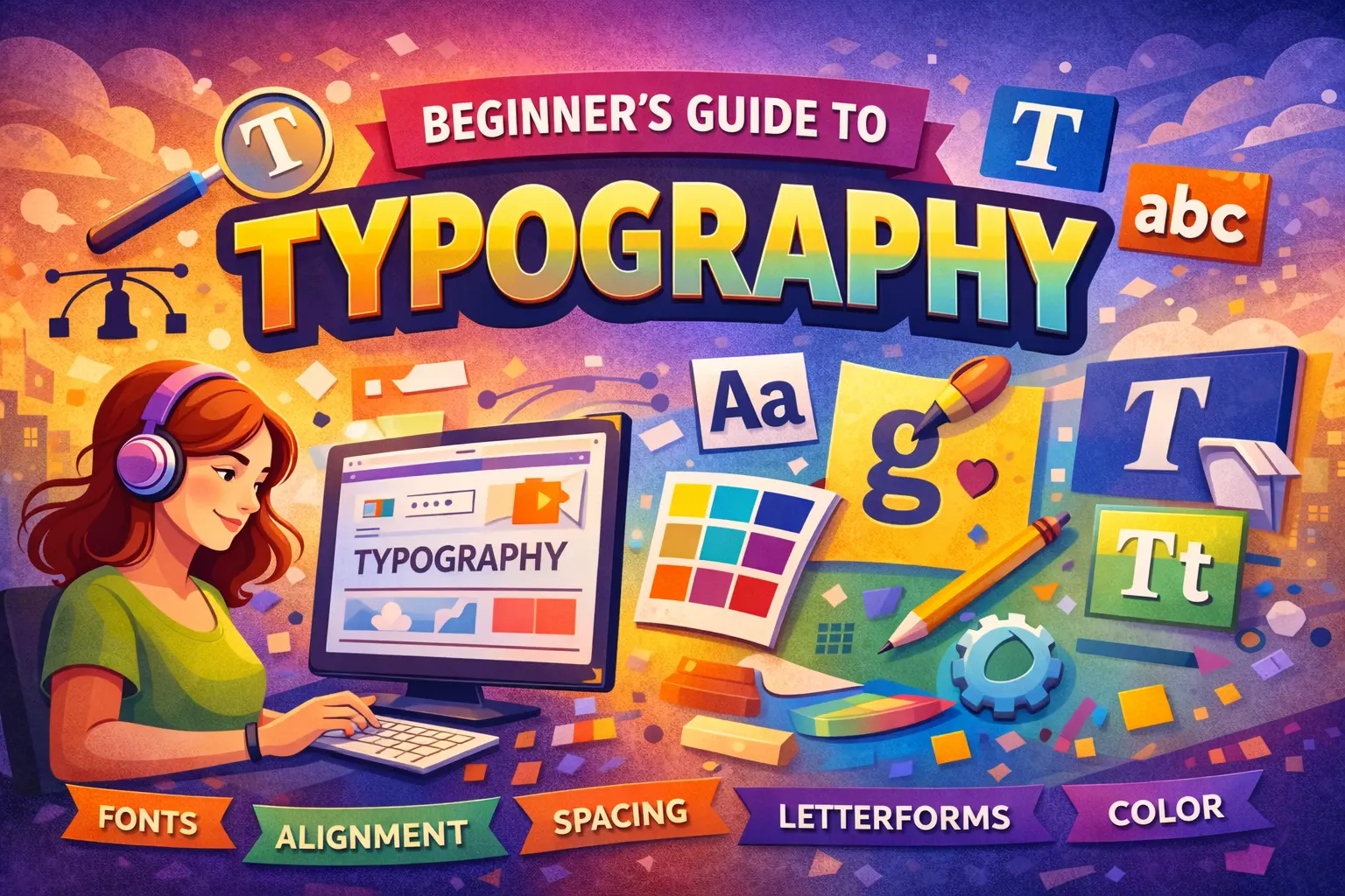
Every letter you see carries a story, yet most people blur its identity. Social media adds to the mix by using these terms loosely, which makes it hard for beginners to understand what each field truly represents. This guide clears that confusion in a simple way. Calligraphy is writing, Hand Lettering is drawing and Typography is designing and arranging letters. Once you learn the difference between typography vs. calligraphy, your design work becomes sharper and more confident. Experts like Richard Wideman and Brittany Russell highlight how essential this understanding is for anyone who wants to grow as a designer. This is your chance to learn the real language behind the art of letters and build a stronger foundation in visual design.
Calligraphy is the discipline of writing letters through controlled, continuous strokes. The calligrapher uses trained muscle memory, pressure variation and rhythmic flow to create decorative writing that feels both structured and expressive. Every movement matters because corrections are not part of the process. The craft adopts spontaneity, moment-to-moment precision, and the integrity of each single stroke. From Copperplate to Blackletter, Brush Calligraphy to Pointed Pen work, calligraphy relies on tools such as dip pens, nibs and brushes, each adding its own texture and nuance. Artists like Ricardo Rousselot Schmidt, Molly Suber Thorpe, and Ivan Castro have shaped global understanding of this art, which is rooted in the Greek term kalli, meaning “beautiful.”
Typography is the process of designing, arranging and applying systems of pre-designed letters. Type designers build typefaces by balancing legibility, structure and aesthetics so they can function across countless contexts. Unlike hand-drawn lettering, typography relies on repeatable, prefabricated forms. Graphic designers then use these typefaces to create compositions that support meaning and communication. Modern contributors like Juanjo Lopez and platforms such as TypeNetwork continue to push the evolution of typographic systems.
The terminology around type often gets misused. A typeface refers to an entire family of related designs, such as Helvetica, which offers a broad range of styles. A font is one specific style or weight within that family, such as Helvetica Bold or Helvetica Light. In digital environments, what appears on-screen is always a font. Tools like Glyphs for Mac empower designers to build and refine typefaces with precision.
Hand lettering is the art of drawing letters. Unlike calligraphy, which depends on singular strokes, lettering allows the artist to sketch, adjust, erase and refine characters repeatedly. The goal is to produce a custom, one-off design to a specific purpose. Artists like Martina Flor and Ivan Castro demonstrate how lettering blends craftsmanship with problem solving, making every piece a personalized visual composition. Faux calligraphy, often mistaken for traditional calligraphy, is actually a form of hand lettering because the artist draws the letterforms and fills them in.
Social media has blurred the boundaries between Brush lettering vs. Brush Calligraphy, especially when terms like “brush lettering” get applied to “brush calligraphy.” Tools alone do not define the discipline. Chalk lettering, for instance, is entirely drawing-based, even though the medium suggests a calligraphic presence. Sign painters such as Leo Calderon have long emphasized that lettering is about constructing forms, not writing them.
Digitization, along with scanning and vectorizing hand-made work, often blurs these boundaries for beginners. Recognizing each method’s core purpose helps designers navigate these overlaps with more confidence.
Clear terminology enhances professionalism. In creative environments where credibility matters, design students and emerging practitioners must be able to distinguish writing, drawing, and designing letterforms. Using the correct terms builds trust when engaging with clients, teams, and industry partners. The Yeldo Mar Baselios College encourages learners to explore these disciplines more deeply through structured coursework and hands-on practice. For anyone seeking to specialize, Yeldo Mar Baselios College stands out as a strong destination for the best typography course in Kerala and a high-impact graphic design course in Kerala. Understanding these concepts behind Typography vs. Calligraphy will refine your craft, sharpen your communication, and position you for success across the creative sector.
Tags: Typography,caligraphy,typography vs caligraphy
June 27, 2026
June 27, 2026

June 27, 2026

June 27, 2026
June 27, 2026
June 26, 2026
June 26, 2026

June 24, 2026
May 29, 2026
May 29, 2026
May 28, 2026
May 28, 2026
May 28, 2026
May 28, 2026
May 28, 2026

April 30, 2026

April 30, 2026

April 30, 2026
April 30, 2026
March 28, 2026

March 28, 2026
March 25, 2026

March 21, 2026
March 18, 2026

February 25, 2026
February 25, 2026
February 14, 2026
February 11, 2026

January 19, 2026
January 17, 2026