- Email yeldocollegesmd@gmail.com
- CALL +91 98461 10506 +91 98468 77776
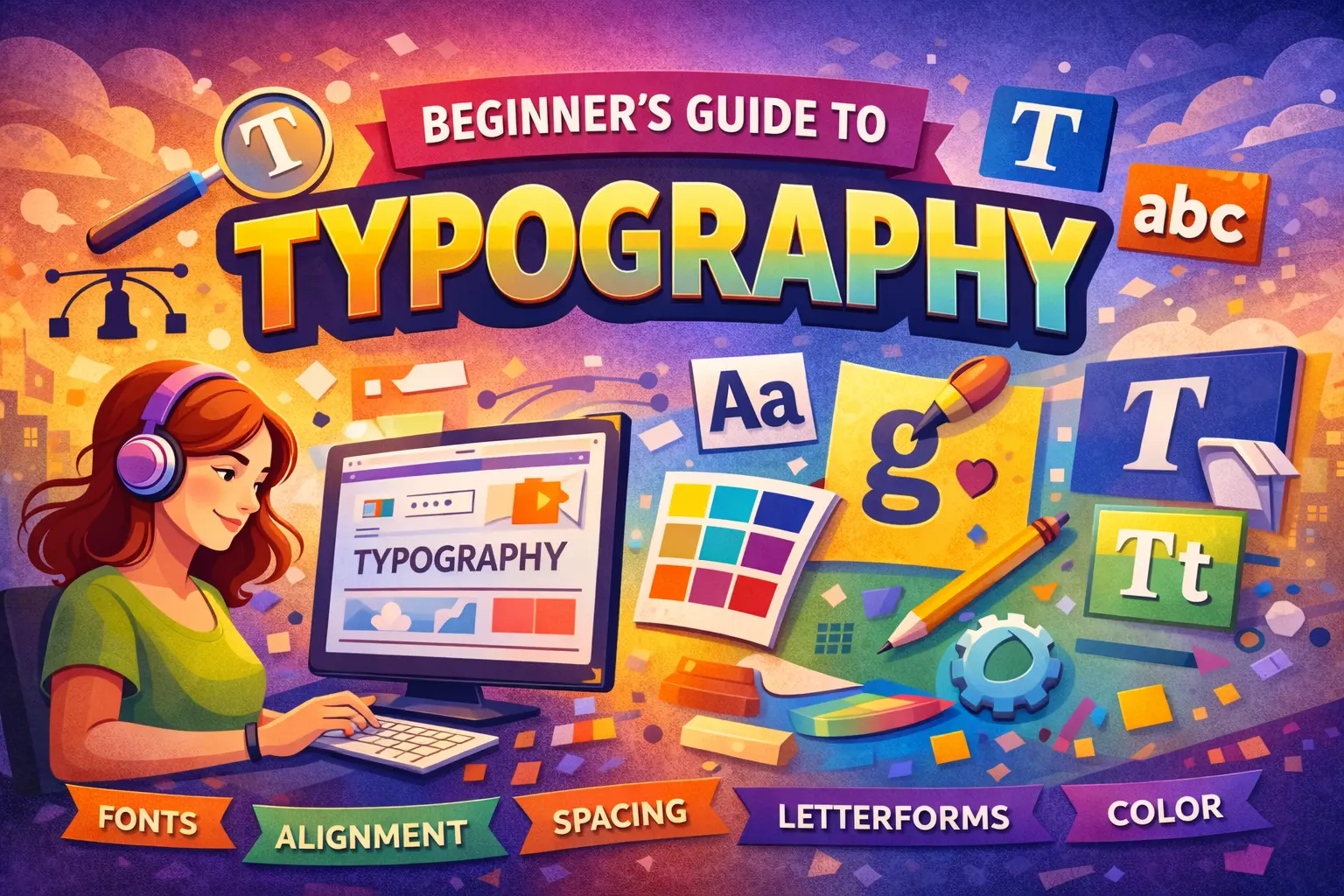
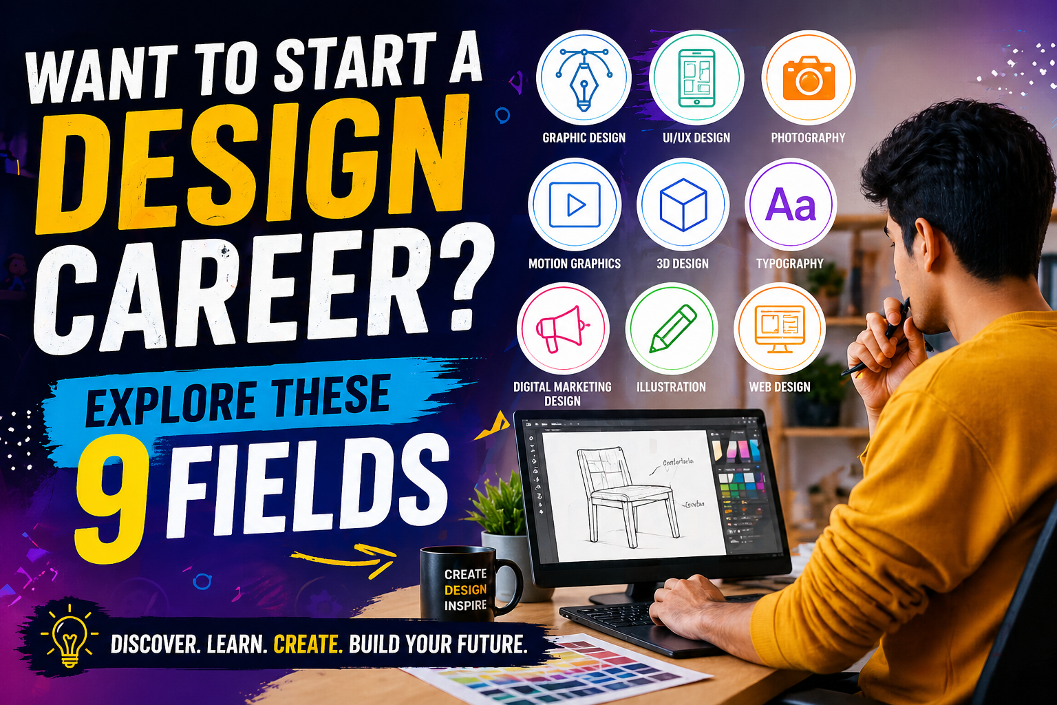
Imagine words leaping off the page to speak, persuade and command attention. That is the power of typography. It goes far beyond choosing fonts. It defines how words appear, resonate and create meaning. Every letter carries weight, rhythm and personality. When arranged with intention, text does more than inform, it leaves an impact. Those who master typography develop sharper visual judgment, stronger communication skills and greater creative confidence. If design is your path, begin here. This guide will show you how to use letters as structured tools for meaningful visual communication.
Typography is the art and technique of arranging letters and text in a way that makes written language readable, clear and visually appealing. It involves choosing typefaces, adjusting spacing, controlling alignment and structuring text to communicate effectively.
Many beginners confuse these two.
● Typeface is the design of the letters. For example, Helvetica.
● Font is the specific style within that typeface, like Helvetica Bold, 16pt.
Think of a typeface as a family name and the font as a specific member of that family.
Typography surrounds us:
● Newspaper headlines
● Movie posters
● Instagram posts
● Website designs
● Packaging labels
● Hoardings across the city
Every time you read something, typography influences your experience.
Good typography:
● Improves clarity
● Builds trust
● Creates emotional tone
● Strengthens brand recall
Bad typography can make even great content look unprofessional.
Invention of the Printing Press
During the 1440s, Johannes Gutenberg developed the movable-type printing system. This innovation transformed communication and made books accessible to common people.
Typography evolved from metal type blocks to:
● Phototypesetting
● Desktop publishing
● Web typography
● Responsive typography
Today, typography adapts to screens, devices and user behavior.
● Renaissance serif typefaces
● Bold display fonts from the industrial age
● Modernist sans-serif movement
● Digital typography revolution
Today,typography is dynamic.Variable fonts, responsive sizing and UI focused readability define modern design. Digital designers must think about mobile screens, accessibility and performance.
Typography communicates before content is read. Bold headlines indicate strength. Serif fonts suggest elegance.
A well spaced and properly sized text reduces cognitive load and keeps readers engaged.
Brands like Apple and Nike are instantly recognizable partly because of consistent typography.
In web and app design, typography directly impacts usability. Poor type choices increase bounce rates.
Clean typography separates amateur layouts from professional ones.
Playful fonts create excitement. Elegant serif fonts convey tradition. Typography shapes perception.
● Typeface vs Font
Typeface is the design system. Font is its specific variation.
● Serif vs Sans-serif
Serif fonts have small decorative strokes.
Sans serif fonts are clean and minimal.
● Font Family
A collection of related fonts within one typeface.
● Font Weight
Light, Regular, Medium, Bold, Extra Bold.
● Kerning
Space between two individual letters.
● Tracking
The consistent letter spacing used throughout a word or paragraph.
● Leading
Space between lines of text.
Proper spacing improves elegance and readability.
● Baseline
The invisible line where letters sit.
● X-height
Height of lowercase letters.
● Ascender and Descender
Parts of letters that extend above or below the main body.
● Cap Height
Height of uppercase letters.
● Left-aligned
● Right-aligned
● Center-aligned
● Justified
Alignment creates structure and balance.
Hierarchy guides the reader’s eye.
● Use larger size for headings
● Medium size for subheadings
● Smaller size for body text
Clear hierarchy creates visual order and improves clarity.
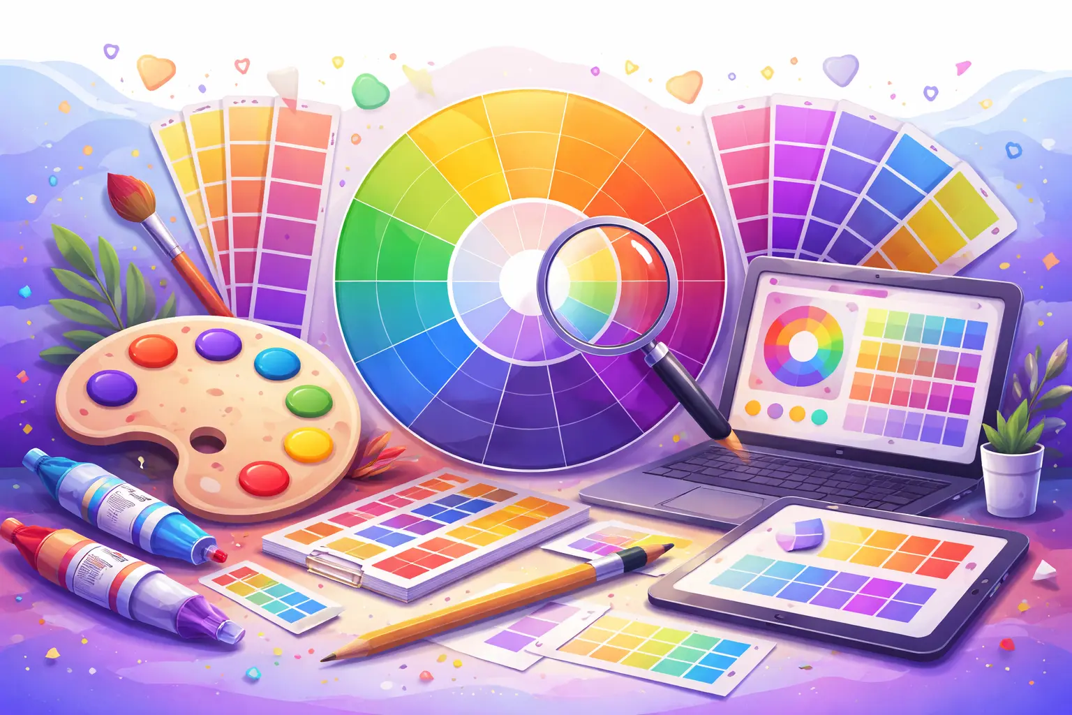
Contrast makes typography dynamic.
● Size contrast
● Weight contrast
● Color contrast
Strong contrast improves readability and engagement.
Alignment keeps design organized. Choose alignment based on purpose. Left alignment works best for long content. Center alignment suits invitations and posters.
Spacing defines breathing room.
● Proper letter spacing
● Comfortable line spacing
● Generous white space
White space is not empty space. It is a strategic space.
Professional designs use 2-3 fonts maximum.
Maintain consistent sizes, spacing and styles. Harmony builds credibility.
● Limit to 2-3 fonts
● Match font to brand tone
● Pair complementary fonts
● Avoid overused fonts
Font pairing should create balance, not competition.
● Minimum 16px for web body text
● Strong contrast between text and background
● Line length between 45–75 characters
● Comfortable line spacing
● Avoid all caps for paragraphs
● Too many fonts
● Poor contrast
● Extremely small text
● Inconsistent spacing
● No clear hierarchy
● Stretching fonts artificially
Never distort a font. Respect the design integrity.
To get started with typography design, begin by observing good typography around you. Observe billboards, analyze magazine layouts carefully and explore design platforms like Behance and Dribbble for inspiration. As you review different works, break down why certain designs feel premium, focusing on their spacing, hierarchy, alignment and font choices.
Start with beginner tools like Canva.
Advance to:
● Adobe Illustrator
● Figma
● Adobe Photoshop
Free tools are sufficient to begin.
● Create simple posters
● Design Instagram creatives
● Try font pairing exercises
● Redesign restaurant menus
Daily repetition builds design intuition.
Join design communities.
Share work on social platforms.
Accept constructive criticism positively.
Structured learning accelerates growth.
The top institutes like Yedlo Mar Baselious College in Ernakulam offer professional typography and design programs with hands-on projects and industry exposure. Learning with mentors shortens your trial-and-error phase.
1.What is the difference between typeface and font?
A typeface is the overall design of letters such as Helvetica or Garamond. A font is a specific style within that typeface, like Bold or Italic in a certain size. In simple terms, the typeface is the family and the font is a specific member of that family.
2. How many fonts should I use in one design?
Follow the 2-3 font rule. Use one font for headings, one for body text and optionally a third for accents. Less is more because too many fonts create visual noise and reduce professionalism. Limiting fonts builds consistency, hierarchy and brand clarity.
3.What Are the Best Fonts for Beginners?
Start with versatile and well balanced fonts such as:
● Helvetica
● Open Sans
● Lato
● Montserrat
● Playfair Display
You can find high-quality free fonts on platforms like Google Fonts, Adobe Fonts and other reputable font libraries. These fonts are beginner-friendly and work well across print and digital formats.
4.What Is the Most Readable Font?
There is no single best font. Readability depends on size, spacing, contrast and line length. For web, Open Sans and Roboto work well. For print, Georgia and Garamond are reliable choices.
5.How Can I Improve My Typography Skills?
Practice consistently. Redesign posters, experiment with font pairing and study professional layouts. Feedback and structured learning help you improve faster.
6.Is Typography Hard to Learn?
It is not difficult, but it requires patience. Basics can be learned in weeks, while mastery develops through regular practice.
7.Can I Learn Typography Without Design Experience?
Yes. Start with fundamentals like typefaces, spacing and hierarchy. With practice, beginners can build strong typography skills.
Typography is the backbone of strong design. It brings clarity, builds strong brands and improves communication. The good news is that anyone can learn it with consistent practice and the right guidance. Start with the fundamentals, focus on spacing and hierarchy and improve step by step. Skill grows through practice and real projects.Join our professional courses in Ernakulam with expert faculty, hands-on training, industry standard tools and career support. Enroll today and build your design future.
Tags: Typography, Typography Design
June 27, 2026
June 27, 2026
June 27, 2026
June 27, 2026
June 27, 2026
June 26, 2026
June 26, 2026
June 24, 2026
May 29, 2026
May 29, 2026
May 28, 2026
May 28, 2026
May 28, 2026
May 28, 2026
May 28, 2026
April 30, 2026

April 30, 2026
April 30, 2026
April 30, 2026
March 28, 2026

March 28, 2026
March 25, 2026

March 21, 2026
March 18, 2026

February 25, 2026
February 25, 2026
February 14, 2026
February 11, 2026
January 19, 2026
January 17, 2026