
- Email yeldocollegesmd@gmail.com
- CALL +91 98461 10506 +91 98468 77776
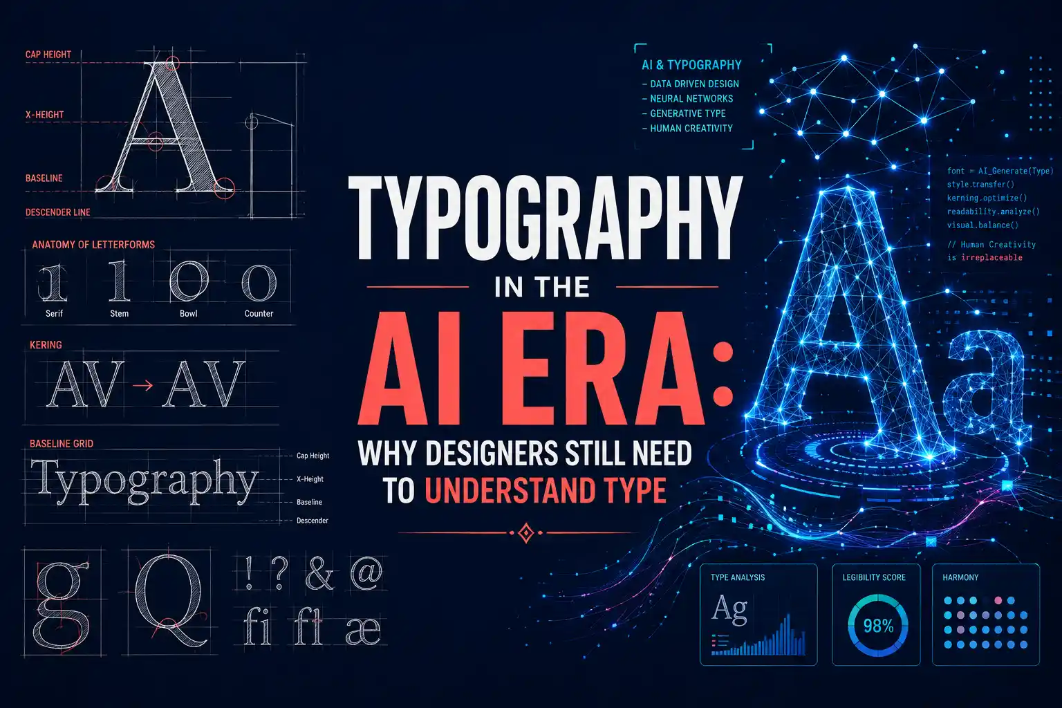
Typography design is evolving as AI becomes increasingly integrated into modern design workflows. AI applications have the capacity to recommend fonts, layout designs, test various fonts, develop visual concepts, and deliver branded graphics within seconds. The rapid pace of AI development raises a crucial question for students pursuing design studies: if AI has the ability to design typography, why should designers study typography?
The explanation is rather straightforward. Typography is not simply about selecting attractive fonts. It influences attention, communication, brand perception and readability across different platforms and media.
AI is now an effective assistant for the exploration of typography. Designers no longer need to manually test every typeface and layout because AI allows exploring different directions fast.
The modern workflows of AI assisted design include: Font discovery
For example, a designer can describe a brand as modern, elegant, youthful, or traditional and use AI to explore typefaces that may match that direction.
These typography design tools are particularly useful during the early stages of a project because they help designers generate possibilities faster. However, AI suggestions still require human evaluation. A font that appears suitable from a description may not work well with the actual brand, audience, content, or platform.
Choosing a font is a conscious design choice. Depending on the font, a brand can look professional, playful, luxurious, sophisticated, traditional, or friendly.
Before choosing a font, a designer needs to take into account:
For example, a decorative font can fit perfectly on a festival poster but will cause troubles in a long paragraph on a website.
Understanding typeface selection allows designers to ask better questions instead of simply accepting an AI recommendation. AI can suggest options, but the designer must decide whether those options communicate the intended message.
A design can look polished while still having poor information hierarchy. Typography tells viewers where to look first, what to read next, and which information matters most.
Designers create hierarchy through type size, weight, position, spacing, contrast, and scale. For example, if a website gives the same visual emphasis to its headline, paragraph, and button, users may struggle to understand what action they should take. This is why students need to understand typography principles and visual hierarchy. AI can generate an attractive layout, but designers need to evaluate whether the information is actually organised effectively.
Typography must work for real readers, not just look impressive in a design preview.
Designers should consider:
A stylish typeface may work well as a large headline but become difficult to read when used for body text.
Legibility refers to how easily individual characters can be distinguished.
Readability refers to how easily and comfortably a person can read a larger body of text.
Both matter in digital interfaces, websites, mobile applications, publications, and advertising.
AI may create visually attractive layouts that contain practical problems such as:
A designer with strong typography knowledge can identify these problems and make the necessary corrections.
AI systems learn from existing visual patterns. As more people use AI to create modern websites, minimalist branding, luxury logos, professional presentations, and technology interfaces, certain visual styles can become increasingly familiar.
This creates a new challenge: how can designers make their work distinctive?
Strong typography design can give a project a recognisable visual voice even when other design elements are generated or assisted by AI.
Typography also has a structural side. Designers should understand basic type anatomy, including:
These characteristics influence how a typeface looks and behaves.
For example, two fonts may have the same point size but appear very different because of differences in x height, width, weight, and character proportions.
When AI recommends a typeface, students who understand type anatomy can evaluate:
This transforms a student from someone who simply accepts AI suggestions into an informed design decision maker.
Asking AI to “suggest two fonts that look good together” may produce useful options, but effective font pairing requires more than visual compatibility.
Designers should consider:
For instance, a bold display typeface might work effectively with a simpler body typeface because the contrast creates hierarchy.
The goal is not to find two fonts that look attractive independently. The goal is to create a coherent type system in which each typeface has a clear purpose.
AI is making visual production faster. This creates an interesting chain:
AI speeds up visual production
↓
More businesses can create polished looking graphics
↓
Generic visual styles become easier to reproduce
↓
Distinctive design becomes harder to achieve
↓
Typography becomes a stronger differentiator
When anyone can quickly generate a visually polished design, thoughtful typographic decisions can help a brand stand apart. This makes typography more relevant, not less relevant, in an AI driven design environment. Designers who understand typography trends can use emerging technologies while still creating intentional and distinctive visual identities.
Students should avoid treating typography as a list of popular fonts to memorise. Instead, they should understand how type works as a complete system.
1. Typeface Selection
Learn how to choose a typeface according to its purpose, audience, content, and visual personality.
2. Hierarchy
Understand how typography guides attention through headings, subheadings, body text, captions, and calls to action.
3. Spacing
Develop control over:
4. Scale
Create consistent relationships between different text sizes.
5. Contrast
Use differences in:
to create visual emphasis.
6. Consistency
Develop repeatable typography systems that maintain the same visual language across a project.
7. Context
Understand how typography changes across:
Students should learn how type behaves, rather than simply memorising which fonts are currently popular.
Typography is not limited to posters or printed publications. It appears across almost every area of visual communication.
Graphic Design
Typography is essential for:
UI/UX Design
Typography helps structure:
Motion Graphics
Designers use typography for:
Animation
Typography can appear in:
This makes typography a valuable foundational skill for students pursuing different creative careers.
There is a major difference between a student who asks AI to create a design and a student who understands what a good design should achieve before using AI.
The second student can:
AI becomes more useful when the designer already has a strong understanding of design principles.
For students exploring a Typography college in Ernakulam, developing these foundations can help them approach AI as a creative assistant rather than allowing technology to make every design decision.
The future designer may use AI to:
But designers will still need to decide:
Students pursuing a BA Animation and Graphic Design College in Ernakulam can therefore benefit from developing both AI literacy and strong design fundamentals. The goal is not to resist AI. It is to understand design well enough to direct the technology instead of simply accepting its output.
Typography has not become less important in the age of AI. It remains essential because good typography involves much more than selecting or generating attractive typefaces. While AI may help in quickening the processes of font selection, composition creation, and experiments with visual solutions, one must have an understanding of hierarchy, legibility, spacing, typography, typeface selection, and visual communication. Typography will be an increasingly important skill for designers as AI is used more frequently in graphic design. The future designer does not have to choose either AI or typography. They need to understand typography well enough to use AI effectively.
A structured learning environment such as Yeldo Mar Baselios College can help students build the creative and technical skills needed to adapt to the evolving design industry.
Artificial intelligence can be used to help find fonts, create layouts and generate AI typography, but it is still necessary for designers to have knowledge in typography in order to control hierarchy, readability, brand voice, spacing and visual communication.
The artificial intelligence can provide recommendations for suitable typefaces basing on the visual style and the brand description. But nevertheless, it should be evaluated by the designer and it is necessary to decide if it will work for the intended audience, for a specific industry, for a certain content, platform, readability needs and brand voice.
AI is going to automate some processes connected with the typography design, but it doesn't mean that it will replace all the processes. Designers will still need knowledge of typographic systems, culture context, hierarchy, accessibility, brand voice and visual direction in order to create successful typography.
Yes. Typography is an integral component of visual communication and is seen in branding, editorial design, advertisements, UI/UX design, motion graphics, packaging, and digital media. The ability to apply typography will allow students to develop more clear, consistent, and professional designs within a variety of creative areas.
It would be best if students learned basic typography concepts before using AI heavily. They can use AI for exploration, finding fonts, experimentation, and iterations but still have to judge the results themselves.
Tags: Typography, typography design, AI typography, typography in AI, typeface selection, font pairing, typography principles, visual hierarchy, type anatomy, readability, legibility, graphic design, AI design, motion graphics, graphic design students
September 22, 2026
September 22, 2026
September 22, 2026
September 22, 2026
September 21, 2026

September 21, 2026
September 21, 2026

September 21, 2026
September 07, 2026
September 07, 2026
August 29, 2026
August 29, 2026
August 28, 2026
August 28, 2026
August 28, 2026
August 28, 2026
July 27, 2026
July 27, 2026
July 27, 2026
July 27, 2026
July 25, 2026
July 25, 2026

July 25, 2026
July 25, 2026
June 27, 2026
June 27, 2026

June 27, 2026

June 27, 2026
June 27, 2026
June 26, 2026